Original article in the Los Angeles Times
JUNE 12, 2009 | 10:00 AM
Ten new paintings by Monique van Genderen include some of the most ambitious works this increasingly accomplished artist has produced.
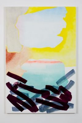
For her third solo show at Happy Lion Gallery — the last was in 2005 — Van Genderen established a uniform format. Each work is 6 feet high and 4 feet wide, familiar dimensions for paintings that address a spectator’s body as well as eye. Their carefully calibrated scale initially moves you into place, effortlessly showing you where to stand to look at them.
When you do, it’s the painting’s surface that first grabs your attention, with specific colors, shapes and the overall composition registering more slowly. Van Genderen’s surfaces are exceedingly strange — alternately transparent and reflective, and in some areas thinly layered so as to border on translucence. Occasionally it’s matte, but a closer look reveals that those are restricted to the white areas, which also define the physical surface of the wooden panels on which she works. The effect heightens the difference between the material and visual distinctions in each abstract picture.
The various levels of transparency and reflection are achieved through different types of paint. Van Genderen employs oil, enamel and alkyd (a resin-based oil paint). Whenever the white ground appears — sometimes as a large expanse, elsewhere as just a narrow sliver between color shapes — it is flat and optically inert, as if sucking all the light out of the room. The surface plane gets underscored as the meeting ground of the corporeal and the visual, the physically embodied and the fleetingly glimpsed.
This bracing dialogue between body and sight continues in the colored forms Van Genderen paints. Some emphasize a single stroke with a wide brush. Others suggest torn sheets of colored paper. (Her past work has included collages and murals made from sheets of cut vinyl.) Handwriting — a kind of pictorial penmanship — frequently comes to mind, and with it the art of calligraphy.
Van Genderen’s color choices range from organic to synthetic — from the pastoral colors of the garden to the neon lights of the nightclub. There are nods to Andy Warhol’s flowers and to Georgia O’Keeffe’s very different blossoms. Matisse’s sumptuous interiors turn up in window-like shapes that seem to frame a painting-within-the-painting.
“Nocturne,” one of the few works in the show to carry a title, wears its kinship to James McNeill Whistler on its gorgeous sleeve. Dark, flickering streams of watery gray colors speckled with turquoise blue and bright green conjure fireworks on a river and a Persian rug.
The result is a surprising spatial complexity achieved only through the play of actual light and color. Van Genderen’s paintings recall 1950s sources as diverse as Helen Frankenthaler’s Color-field paintings, which are essentially watercolors writ very large (and in oil on canvas), and Lorser Feitelson’s “magical space forms,” which employ graphic design techniques to manipulate the illusion of three dimensions through emphatically two-dimensional methods. Still, these paintings aren’t merely retro.
What Van Genderen adds to the pictorial mix is the experience of a world awash in modern reproductions — both mechanical, as in printed magazine, book or catalog pages, and digital, as viewed on the screens of televisions, computers and cellphones. The printed page and the transmitted screen seem to be the ground zero for these remarkable abstract paintings, which are among the most compelling being made right now.
— Christopher Knight
The Happy Lion Gallery, 963 Chung King Road, Chinatown, (213) 625-1360, through July 11. Closed Sundays through Tuesdays.
Photos: Two of Monique van Genderen’s untitled works. Credit: Joshua White / Happy Lion Gallery

