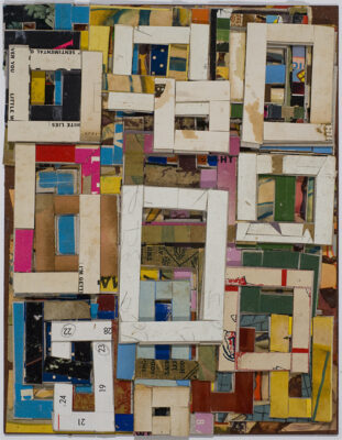
Over the years, Lance Letscher’s work has become richer and more mysterious. “Industry and Design,” the current exhibition of his work at D Berman Gallery, signals new shifts in the collages for which he has gained national notoriety. Some are much thicker and meatier, adding a sculptural depth to the work. And Letscher, a self-described colorist, takes color to a whole new level here: deep and rich and thoroughly satisfying. Combining the illusions of depth created by the color-play with the real spatial depth of the bas-relief brings new layers to art that is created out of reused, printed, drawn, or bound papers that are old enough to be called historical. In addition to Letscher’s abstractions, we see new imagery depicted in simple, blocky forms, mixed with fragments of children’s artwork. Even at its most enigmatic, Letscher’s work engages the mind and eye. Here, Letscher answers questions about new paths in his work.
Austin Chronicle: Why the exhibition title “Industry and Design”?
Lance Letscher: That is a reference to my studio practice and mindset right now: industry in the sense that work is being industrious and design in the sense of formally making design decisions. One of the stronger themes throughout the work is construction … making buildings, and industry in the sense of manufacturing – there are factories and references to robots. There is a thread that goes through the show that is about mechanization and industry.
AC: Yet when we imagine state-of-the-art factories and robots today, they are so different from what you picture. Your imagery is drawn from a different era.
LL: It is more of a storybook perspective.
AC: Tell me about that perspective. The imagery recalls childhood: fragments of children’s drawings and coloring books and toy boxes from the first half of the 20th century.
LL: I kind of drifted into that mode. One thing that influenced that is the commission I did for the children’s hospital [Dell Children’s Medical Center]. I started thinking about kids as my audience. It started to influence the vocabulary I was using.
AC: There are other shifts in the work. For one, you have much more recognizable imagery: blocky house forms …
LL: The images are not representational; they are just cues. If I made a picture of a house with a tree in the front yard and I meant to picture that, then it would be representational. In this case, they function more as associative cues, and they are meant to be read in context with everything else in the picture plane, the marks and scribbles and little words. And that’s my strategy: to create an abstract or emotional or psychological space. The bottom line about my work, and this work in particular, is that it is a form of expressionism. What I am really after is the momentum, the emotional mo-mentum that is built up as you move from one image to the next, not just in one piece but as you move from one piece to another in the show.
AC: I was surprised to find serious themes in the language of childhood, for example, Train and Tunnel, recalling the Holocaust.
LL: The Holocaust has been a focus of my reading since my early 20s. In this show, the relationship to the Holocaust was about mechanization and turning the genocide into an industry. I tried to make them as light as I could, to make it a storybook image or a dream image by using bright colors and drawings made from Crayolas.
AC: Why did you do that?
LL: If a kindergartner were told about it by his parents, what kind of images would you generate? You wouldn’t generate black-and-white, grainy photographs. One thing that I have been thinking about a lot is how children process suffering and images about suffering. I think it is an odd mix of accurate clarity, very in-the-moment experience, and a distancing, a detachment, something that is more akin to fantasy, telling themselves stories about it.