It was high time for Monique van Genderen’s first New York solo show. While the Los Angeles-based artist has become known for large-scale wall pieces such as those she created in Savannah and Philadelphia, this exhibition presented seven works on canvas (84 by 78 or 72 by 48 inches). Each of the nonobjective paintings seems to put forth a specific argument or to make a statement. These bold, self-assured works propose that while things may get a little messy, there is no need to worry, because the artist knows what she is doing.
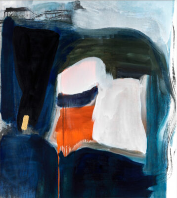
The compositions are asymmetrical, expanding out from the left or right side of the canvas, with the other side remaining relatively blank. Van Genderen seems to start with a large flat plane, frequently a lobed form that suggests a head or a person in profile. This plane is then traversed, covered and countered by smaller marks. In some cases, veils of paint overlap in shimmering layers. Bars or additional planes assert a structure within the canvas. The artist is keenly aware of the edge, usually stopping short of it, occasionally going off of it. Drips always drain downward, as if to orient us to gravity.
The colors are unlovely but also pleasantly unexpected, with contrasting joyful touches. The first painting you came to in the gallery (all are untitled, 2012) has a giant sunny yellow form leaning in from the upper left corner that seemed to cast its glow over the whole room. Subtle, neutral gray jigsaw-puzzle or floor-plan shapes tumble down the relatively open right-hand side. In each of the paintings, the artist applies dry pigment directly to the wet paint. For example, fluorescent yellow and orange pigments accent a largely brown and violet composition that has untouched gessoed canvas along its left side.
Van Genderen constructs a shallow playing space, reminiscent of that in Diebenkorn’s nonfigurative work. One of the smaller paintings has a large fuchsia shape that is overlaid with a white or light violet scrim of paint. In another work, broomor moplike imprints make one think of palm trees in Los Angeles. Recalling Hockney’s L.A. landscapes in both color (bright red and blue, mossy green) and composition, this work has stripes of teal and fluorescent pink that cascade down from underneath the top layers.
There is a sense that the paintings started as small sketches and were then scaled up, as with Franz Kline’s work. But modifications and additions seem to have happened in the transfer too, as well as improvisations that add a scale-specific richness. These are confident explorations by a skilled and thoughtful painter.