Ron Davis, now that he can in no way be regarded as entertaining a West Coast obsession for the simply seductive in surfaces (certain aspects of his work in the past having prompted this concern), and now that his irregular shapes are seasoned by time and never look just radical (those striving for mere radicalism having outdistanced him in this respect), shows himself, in his current show, and the indisputably important painter he is. His eight new works in polyester resin on fiberglass (now thin as decals and literally pasted to the walls) are a significant advance in his investigation of flatness and illusionism. Collectively, they impress through Davis’s inventiveness in utilizing themes from recent art without being at all hackneyed, as in, for example, the lozenge-shaped Five Band Box, which derives from Noland, and the two rectilinear-directed pictures, Four Block Box and Stalls, which make reference to Minimalism. What at first looks slightly banal in its first perceived obviousness supports continued looking to the advantage of the work.
The aspect of reference might seem a side issue, but is in fact crucial since the use of illusionism is ever linked with the possibility that these objects may not be properly paintings but simply illustrations of something else – of the boxes, fan, folded hands, and so on which are their “subjects.” It is the beauty of Davis’s work that he is able to avoid this and that what we see here is far more convincing than what the “subjects” would be in three dimensions. For example, Davis uses the subjects (or objects) of Minimalism, but surpasses them because there is just so much more here than a presentation of geometry. Rather, this geometry operates not only in terms of its stark simplicity (the simpler works are the better) but offers also the visual pleasures of carefully determined and modulated flat surfaces. Put like this it might appear that a confusion of genres is involved, but this is not really the case. Like all major art this is about the resolution of paradox, which is something very different. Like Olitski, but of course in a dissimilar manner, Davis creates flat surfaces where logically one would think they could not possibly exist.
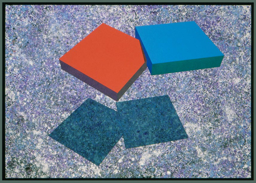
His work is weakest, however, and the surface treatment insufficient to achieve flatness, precisely when the chosen format allows reference to gain the upper hand. While the nature of this work is bound to be referential, problems ensue if that reference becomes specific. Davis still has a lot of the West Coast in his taste and can sometimes lapse into the almost-nostalgic, as in Center Notch, the least successful painting in the show. Here, the reference is not only to the geometry, but the geometry in turn is referential, in this case to something like the floor plan for a twenties moderne interior. This is not, however, an insistence that what may be called regional taste is necessarily impure, rather that the essential thing (as Greenberg said of Caro) is the placing of it. As for Caro and his “Englishness,” were Davis’s taste anything but West Coast taste, “given the concrete physical contexts in which he makes it operate, the results would be freakish.” To my mind, Center Notch does have something of the freakish about it, as does another work, Center Hole, consisting of two lozenge slabs superimposed to leave as negative spaces on their horizontal extremities two rather niggly triangles of wall space. But these two works are exceptional in this respect, and while one can find worrying details in some of the other paintings (Davis’s fondness for off-beat colors occasionally letting in some unfortunate hues, like the top orange in Plane Sawtooth; and sometimes the negative shapes seem a trifle unconsidered), the whole show is impressive. And particularly so are the two paintings, Stalls and Sawtooth.
The strength of Davis’s blatantly illusionistic formats has been that they seem so naturally to dictate the existence of a painting’s design. Everything that is there is there because it must be there. There simply don’t seem to be problems like worrying whether this shape should be a bit larger or smaller or whether the edge should be shortened or extended. At least that is the impression the best work gives, a kind of inevitable rightness. Of course problems of adjustment are involved, but one doesn’t notice them at first. It is only after a while that you notice, say, that the “vertical” planes of Sawtooth aren’t all vertical but begin gradually to slant toward the left-hand side of the picture, thus allowing the image a certain relaxed flexibility and preventing a too boxed-in look. But this ease doesn’t look striven for, and this is what is important. Again, the naturalness with which the illusionistic format creates both internal divisions and literal shapes could be a drawback in stressing too overtly the tendency toward illustration. But by making the pictures semi-transparent and hence revealing the dark “back” shapes of the subjects, Davis stresses the artificiality of the situation he is involved with. If these “back” shapes in Sawtooth hadn’t been visible enough to create an image of overlapping lozenges which coexists with that of the folded band, the painting would be simply illustrative. And if the juxtaposition of colors, of varying blues, greens and reds in the center three “flaps” of this work hadn’t so precisely affirmed their interdependency, its literal shape could never have accomplished that surprising feat of being both a designed contradiction to flatness and yet a visual affirmation and mainstay of flatness. Here, of course, both design and coloring of edge areas are crucial. In Stalls, the protruding triangles at the upper right edge are strongly and flatly colored in comparison to the rest of the work, and this helps it rest so firmly on the wall. In Fan, the decisively drawn lower flap achieves this same result. Both these works are, significantly, very straightforward in their design, as are the two Sawtooth paintings. In contrast, the ambitious, but not entirely successful, Four Block Box seems too complicated, the “back” shapes too hard to sort out for it to achieve the fluent strength of Davis’s best pictures. And that Davis can now ally fluency of design to an adjustment of flat color without much recourse to that lacteal flecking of much of his earlier work (and which was really just using a convention of surface properties rather than coming to terms with surface itself) is very much to his credit. While his surfaces are still patently artificial and the ultimate affirmation of flatness very much depends on their shininess, they are never prettified. Indeed, although the colors are often high in intensity and brightness, the effect is almost sober and certainly distinguished.